Turning a four-hour editing job into a twenty-minute review.
An AI-assisted workflow that helps podcast teams turn long-form episodes into publishable social clips — without handing editorial judgement over to the model.
UX case study
Role
Product discovery · UX research synthesis · User flows · Wireframing · AI-assisted prototyping
Tools
Figma · Claude Design · Claude Code
Client
Latent Spaces
Field
Digital design
Year
2026
Overview
The short version
LettheAIdotheboringpart.Keepthechoosinghuman.
The problemFour to six hours of cutting per episode. The only bit that needs taste — picking the good moment — takes seconds.
The moveThe AI suggests clips and says how sure it is. You spend your time choosing, not cutting.
The resultTen screens, and nothing posts by itself. You can see exactly where a person still decides.
✦The AI finds the clips. You decide which ones are any good.
What the project was, and what I did on it
Latent Spaces was exploring an AI product for podcast teams: take a long-form
episode, find the moments worth clipping, prepare them for social. The
technology was the easy part. The design question was harder — how much should
the system decide, and how much should the person?
I defined the end-to-end experience: mapped the task and its alternate paths,
worked out where automation helps and where it gets in the way, and built an
interactive prototype of ten screens from upload to export.
0
Screens
wireframed and prototyped end to end
0
Map artifacts
two task flows, a decision tree, a storyboard
0
User types
with different authority over what gets published
0×
Faster
target review time against manual editing
The full product, at a glance
01
nanoclip.ai
Dashboard — the drop zone leads
02
nanoclip.ai
Upload — file or YouTube URL
03
nanoclip.ai
Configure — smart defaults, pre-filled
04
nanoclip.ai
Processing — every stage named
05
nanoclip.ai
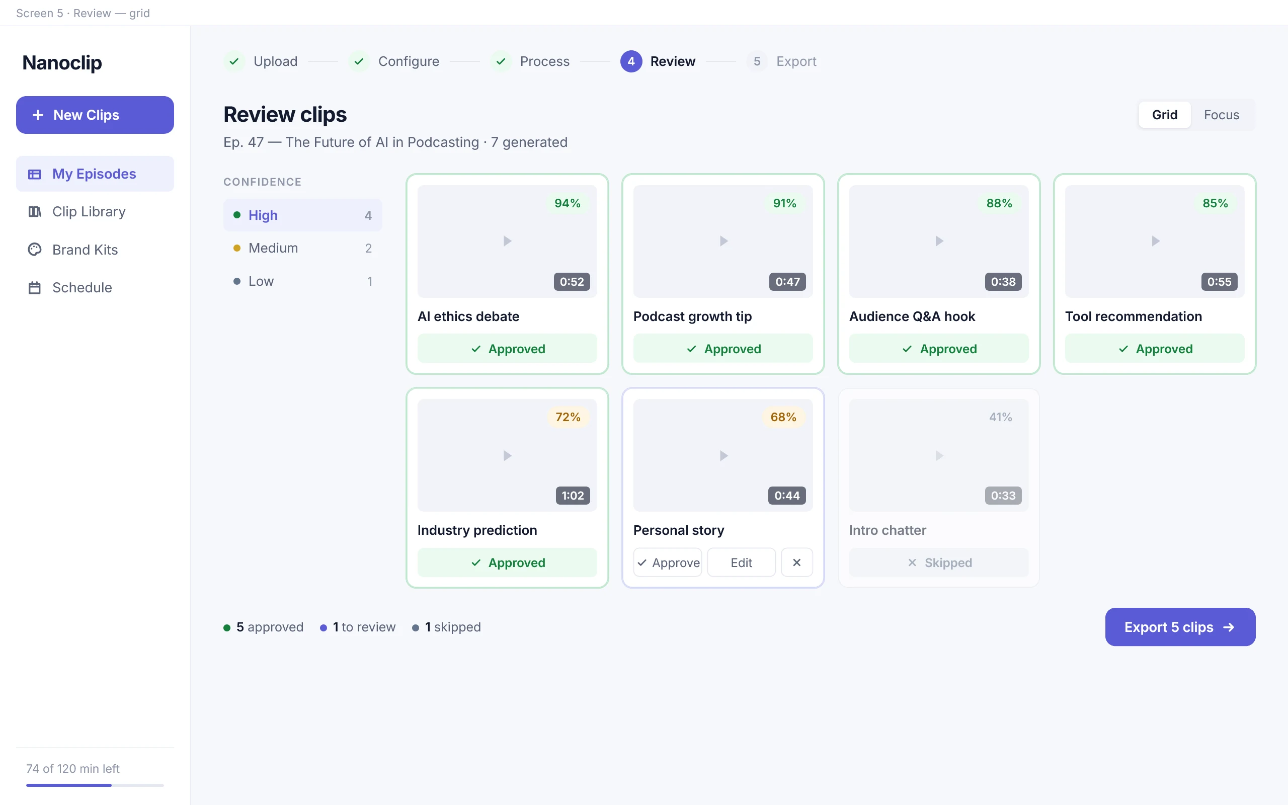
Review — grid, for comparison
06
nanoclip.ai
Review — focus, for judgement
07
nanoclip.ai
Editor — four controls, no timeline
08
nanoclip.ai
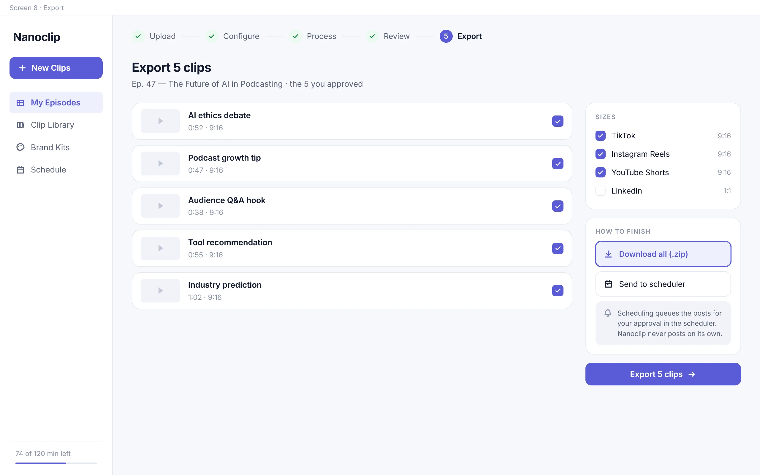
Export — per platform and format
09
nanoclip.ai
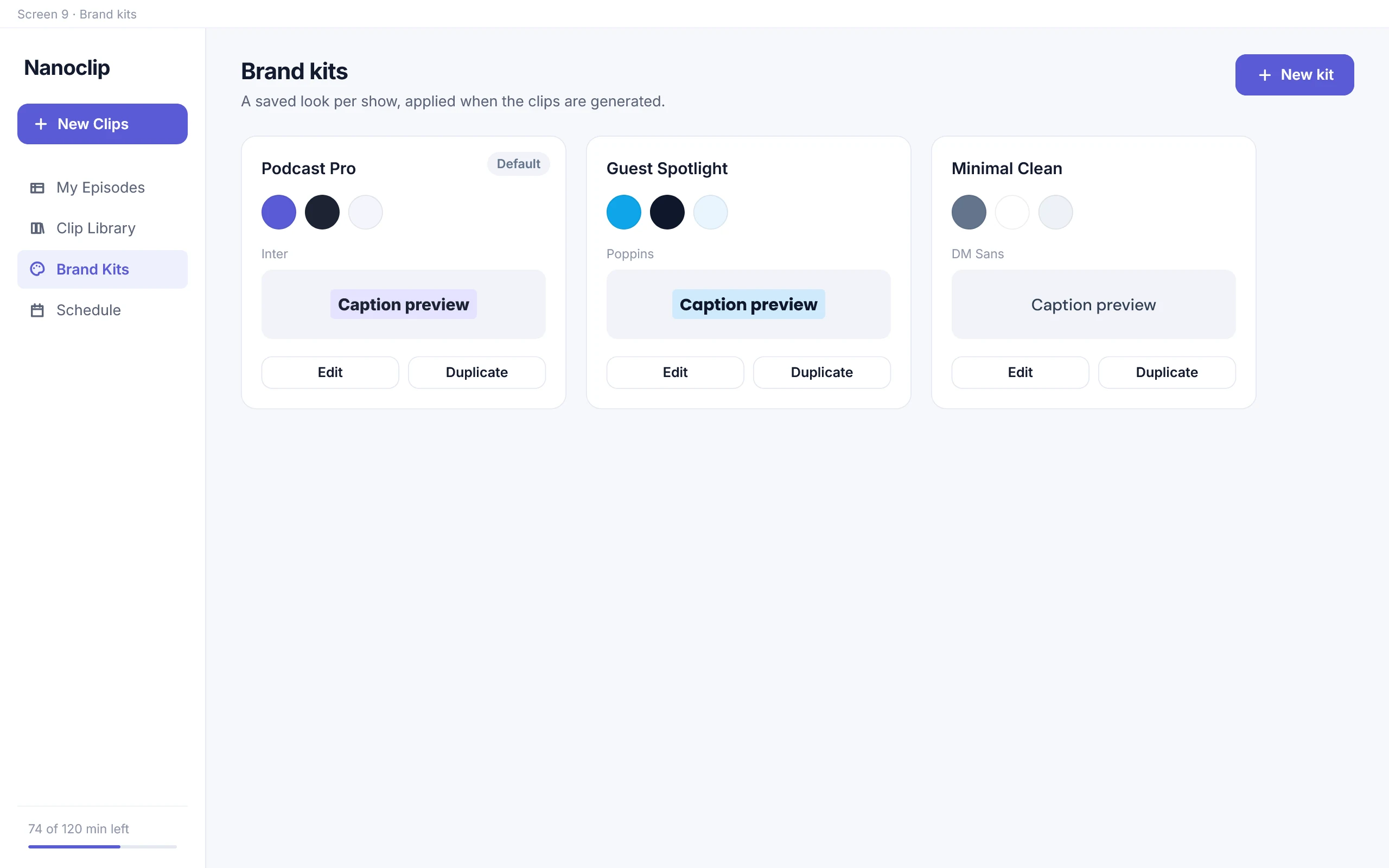
Brand kits — decisions, saved
10
nanoclip.ai
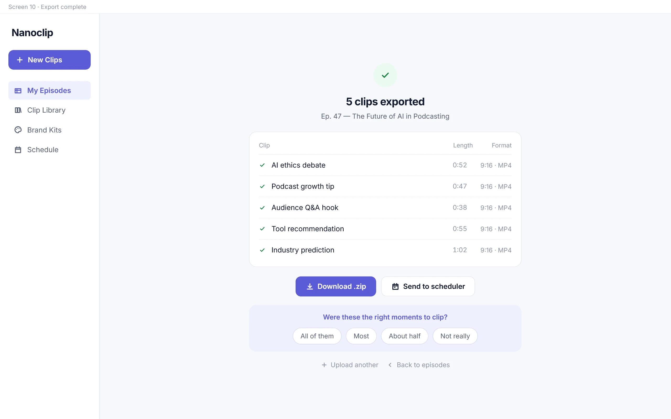
Done — and one question asked
The problem
◆Four hours of work to make six decisions that each take a second.
Doing it by hand
4–6 hours
Per episode. Scrubbing, cutting, reframing, captioning, branding, exporting.
The target for this flow
~20 minutes
Of which only the review is human attention — the processing runs without you.
A design target taken from the annotated task flow, not a measured result. What it changes is the nature of the job: from production work to editorial judgement.
Why full automation is the wrong answer
It is skilled work, but almost none of it is creative work. The creative
decision is which moment is good, and that takes seconds.
Existing tools solve this by automating the whole chain — which trades one
problem for another. The tool picks the clips, and the user approves output they
did not shape, with no way to tell a good suggestion from a confident-sounding
bad one.
How can the path from a long-form episode to publishable social clips get
shorter, while the person stays informed, in control, and responsible for the
final editorial decision?
Who it’s for
●Two users. Only one of them is allowed to hit publish.
The host
Runs a show solo. Records, edits and posts. Wants clips out fast, but the
voice on screen is theirs — they will not post something they haven’t
watched. Publishes directly.
The VA / editor
Handles clips across several shows, each with its own look. Works in
batches, and cannot publish alone — the host approves first. Needs a handoff
step, and a way to keep shows from bleeding into each other.
What that difference changed in the product
These two do not have the same authority over what gets published, and that
drove a lot of the structure. The second one is why the product has brand kits,
workspace switching, and an explicit “submit for review” path rather than a
single publish button.
Secondary task flow — the VA / editor path across multiple shows, with the
host approval loop and the rejection path back into editing.
Mapping the experience
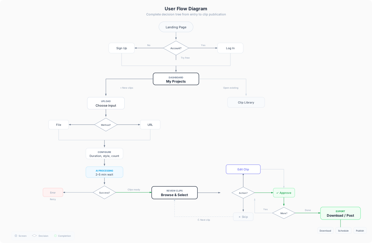
✳I mapped what breaks before drawing any screens.
User flow — the full decision tree from landing page to publication, including
the sign-up branch, the input-method fork, and the processing error and retry
path.
What the map caught that a mockup would have missed
Before drawing any interface, I mapped what the user decides at each stage,
where the system can act alone, and what happens when it fails. This exposed
states a happy-path mockup would have skipped — failed processing and retry, the
“regenerate” loop back from review, the case where every clip gets skipped.
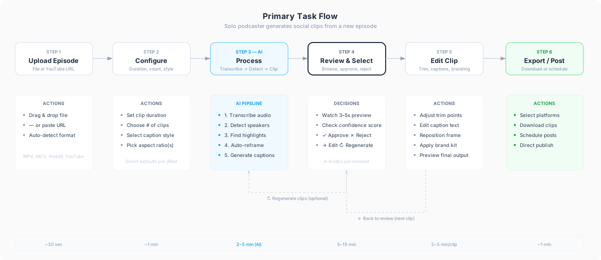
It also made the time budget visible, which is what the pipeline below is built
from.
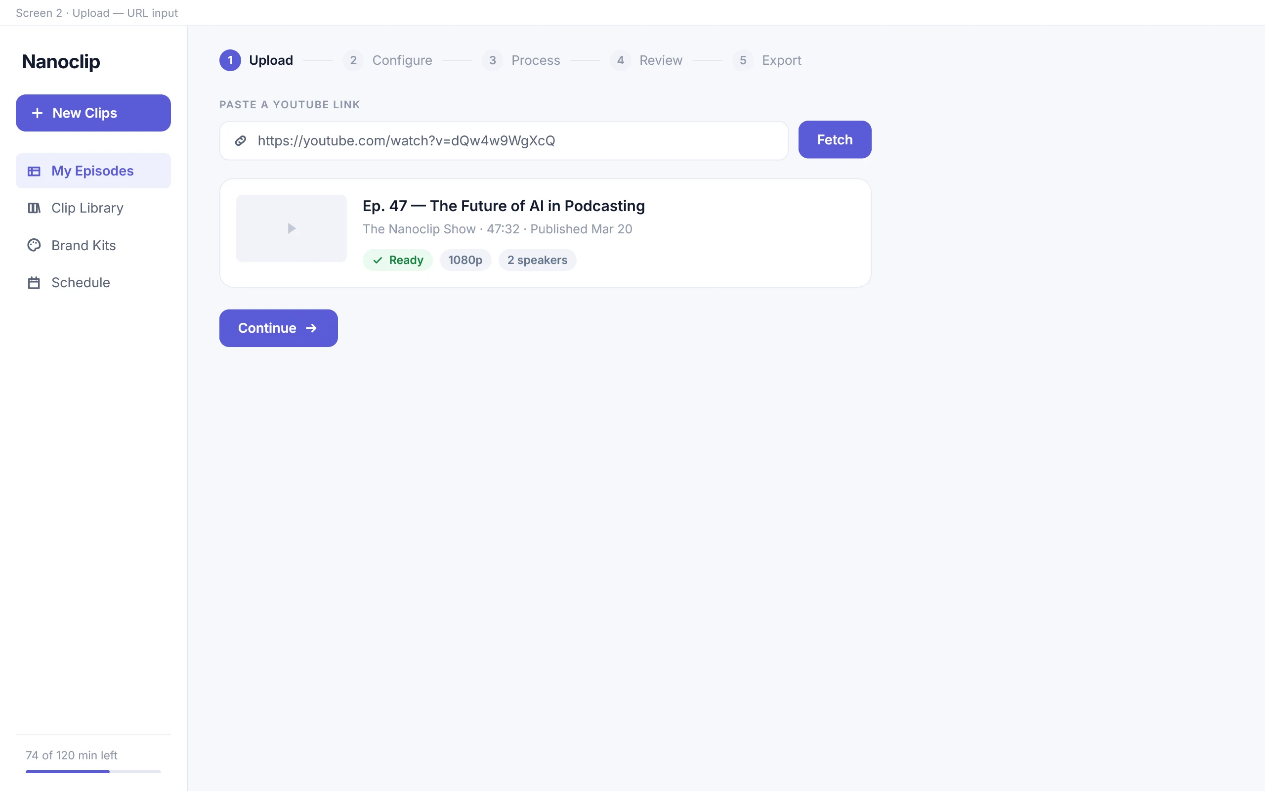
Drag in a file or paste a YouTube URL. The format is detected rather than asked about.
Drag & drop
Paste URL
MP4, MOV, WebM
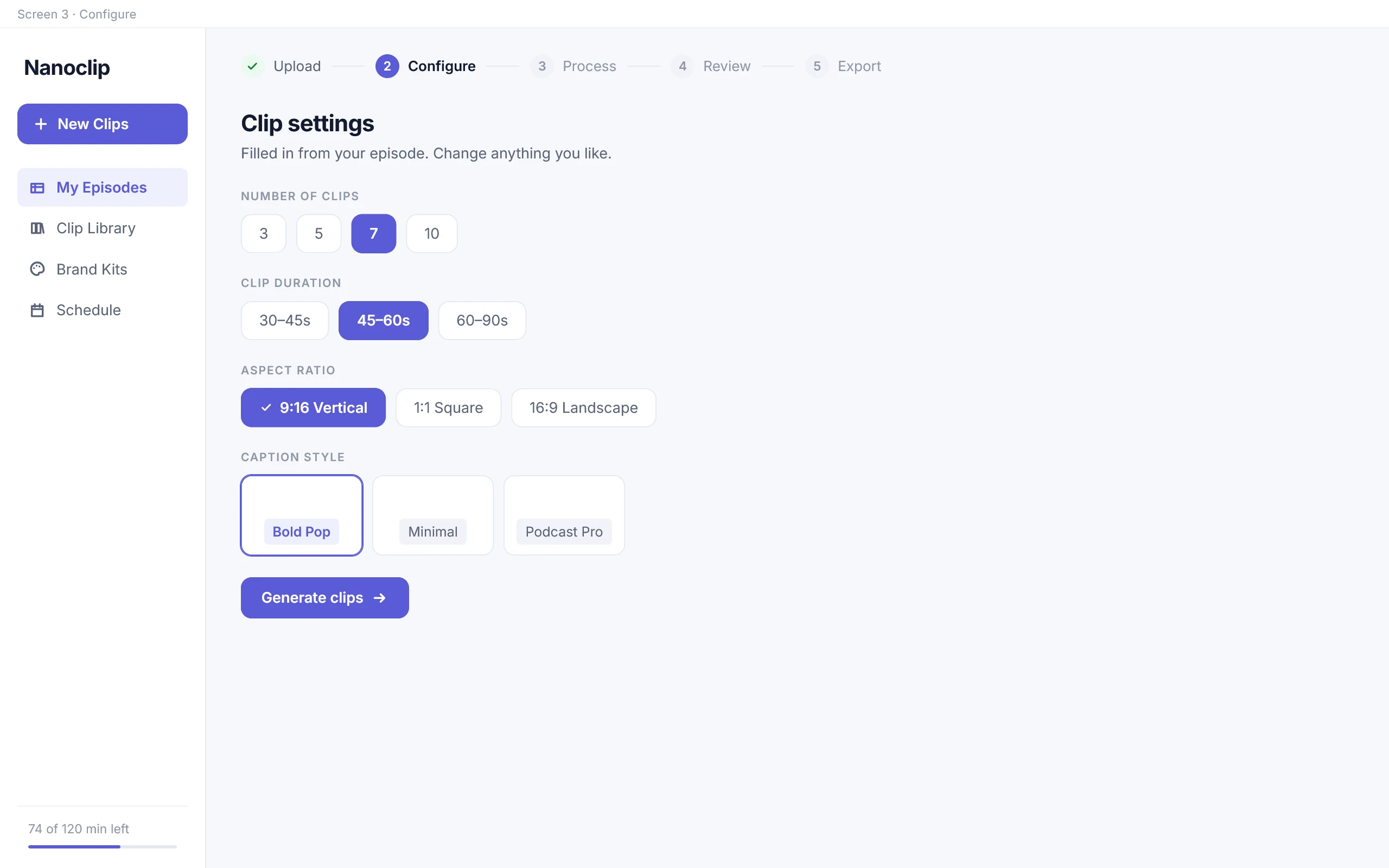
Clip count, duration, caption style and aspect ratio — all pre-filled, all changeable.
Smart defaults
Clip length
Aspect ratios
Caption style
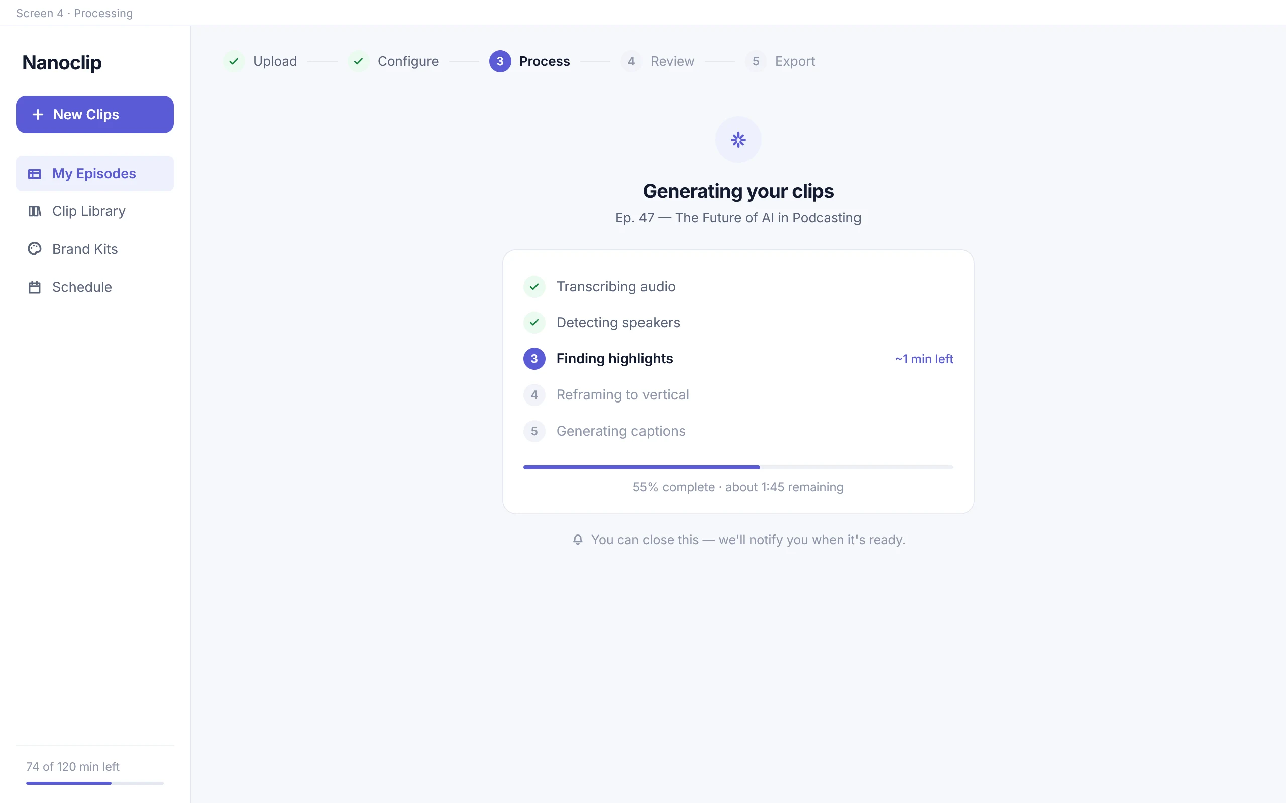
The AI pipeline runs on its own. The user can leave the page and be notified when it finishes.
Transcribe
Detect speakers
Find highlights
Reframe
Caption
The only step that genuinely needs a person. Compare the generated clips, then approve, edit or skip each one.
Confidence bands
Approve
Edit
Skip
Regenerate
Download the batch or schedule the posts, per platform and per format.
Download .zip
Schedule posts
Per-platform sizing
Click a stage to see what happens inside it. Times are the budget the flow was designed against.
Primary task flow — the host’s path from upload to export, annotated with the
actions available at each step and the time each step should take.
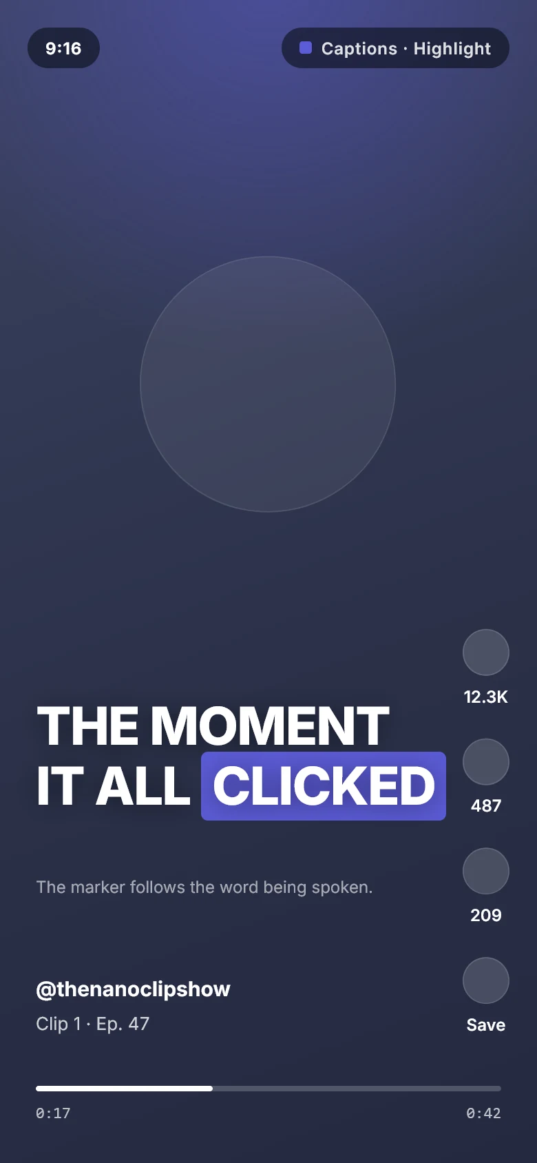
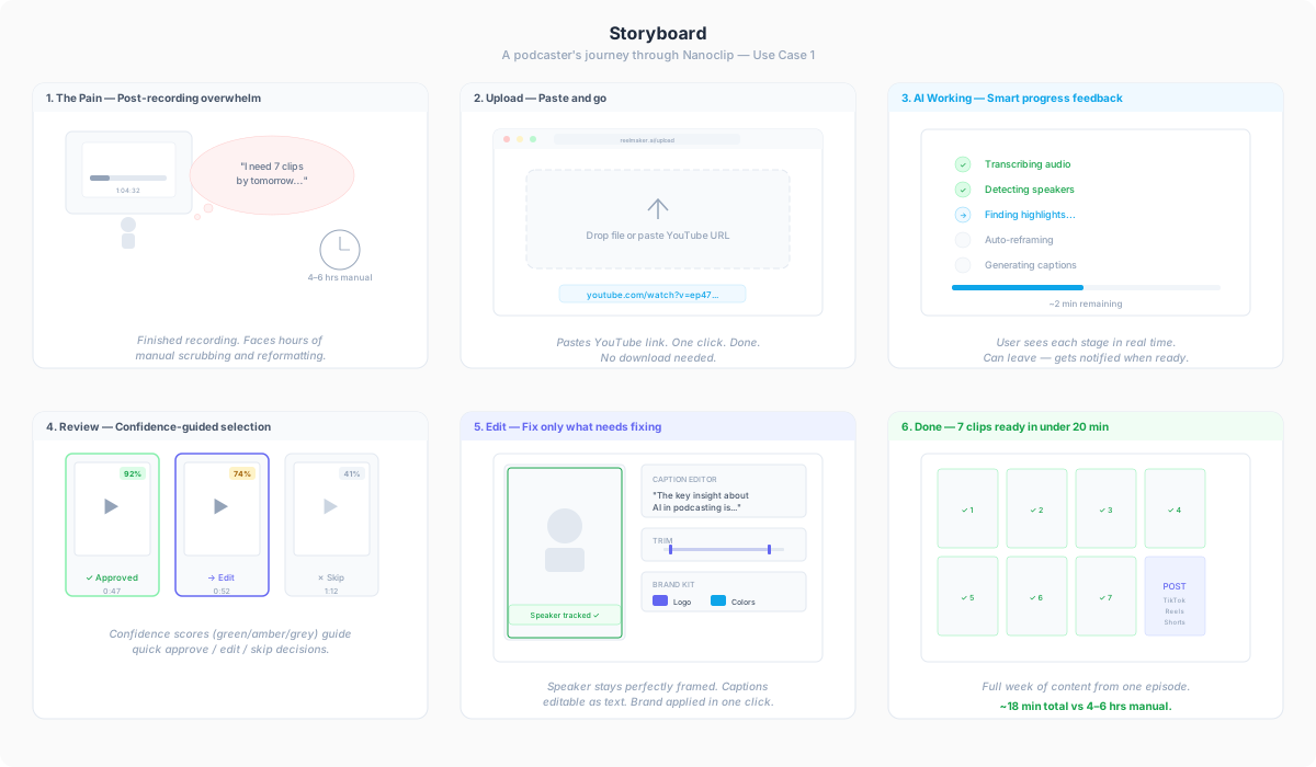
I storyboarded it as a narrative too — starting from the dread after a recording
session, not from the moment someone opens the app.
Storyboard — a podcaster’s journey through Nanoclip, from post-recording
overwhelm to scheduled posts.
Key UX decisions
01
Start where the work arrives
The dashboard leads with the drop zone, not a list of past projects.
It also accepts a YouTube URL as well as a file. Many podcasters publish to
YouTube first, and asking them to download a two-hour video in order to
re-upload it adds twenty minutes of waiting to a thirty-second task.
nanoclip.ai
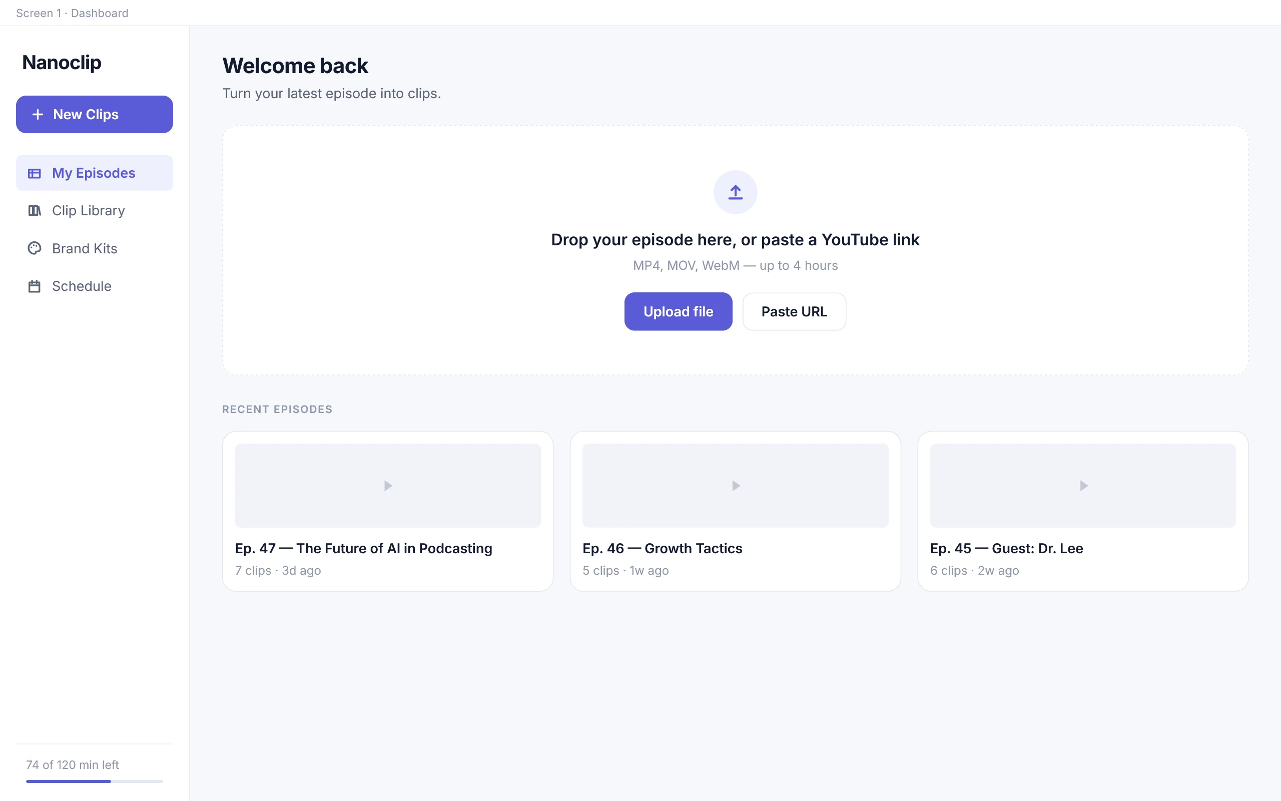
The drop zone leads — a new episode is the usual reason to open this.
nanoclip.ai
Or paste a URL, and skip the download entirely.
02
Smart defaults before advanced control
Clip count, duration, aspect ratio and caption style arrive pre-filled, so a
first-time user can move on without making five decisions about a system they
have not seen work yet.
Nothing is hidden — every control is right there if you want it. Filling the
fields in and letting people change them teaches the product far better than
asking five questions up front. By the second episode most people have
settings they stick with, which is exactly why those settings later become
saveable brand kits.
nanoclip.ai
03
Show the AI working
Rather than a spinner, the screen names each stage as it runs, with progress and
a time estimate.
A named stage makes a two-to-five minute wait feel like something is happening
rather than something is stuck. It also shows people what the tool actually
does — so when a clip comes back badly cropped, they know which part got it
wrong and which control to reach for.
nanoclip.ai
Processing episode
~2 min remaining
✓Transcribing audio
✓Detecting speakers
✓Finding highlights
✓Auto-reframing to vertical
✓Generating captions
The processing screen as designed. The user can also leave and be notified — a five-minute wait is not worth guarding.
04
Two modes of review, for two different questions
Review is where the user’s real work happens, and it involves two different
questions that need different layouts — a comparison question and a judgement
question.
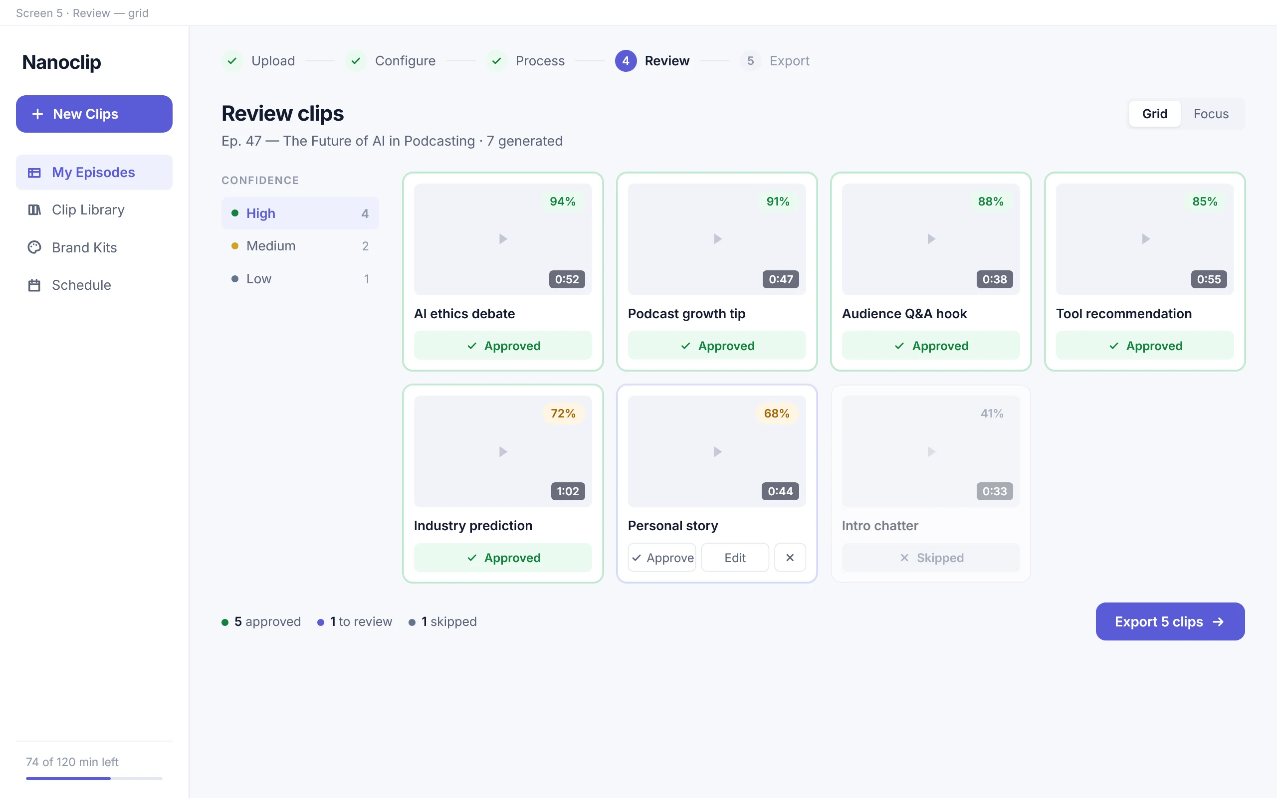
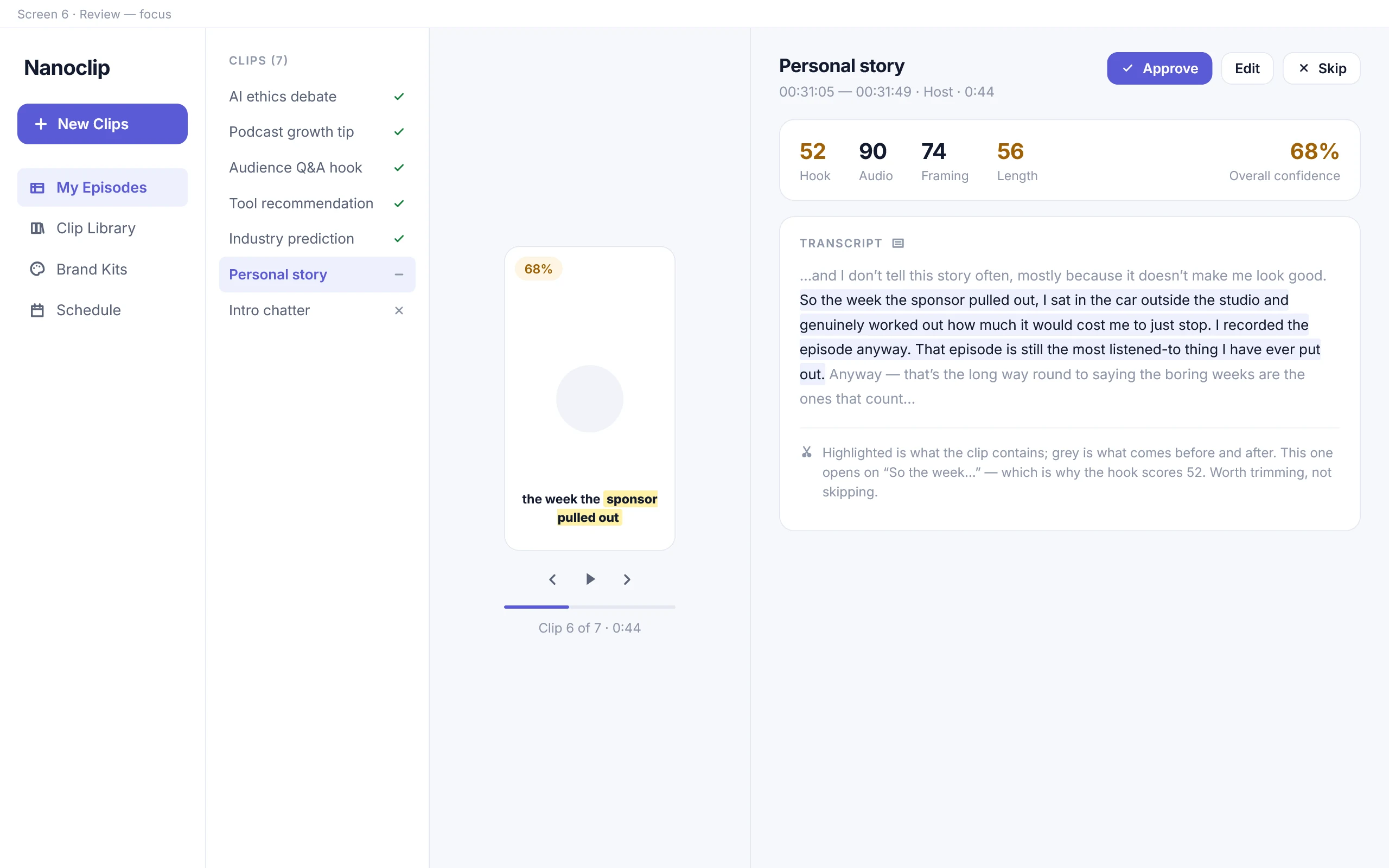
Same clips, two questions — switch between the views:
nanoclip.ai
“Which of these are worth my attention?” — a comparison question. Every clip is visible at once with its duration and confidence band, and approve / edit / skip are one tap away.
nanoclip.ai
“Is this specific clip actually good?” — a judgement question. The transcript and surrounding conversation are shown, so the user can see whether the clip cuts off mid-thought.
05
Editing as correction, not creation
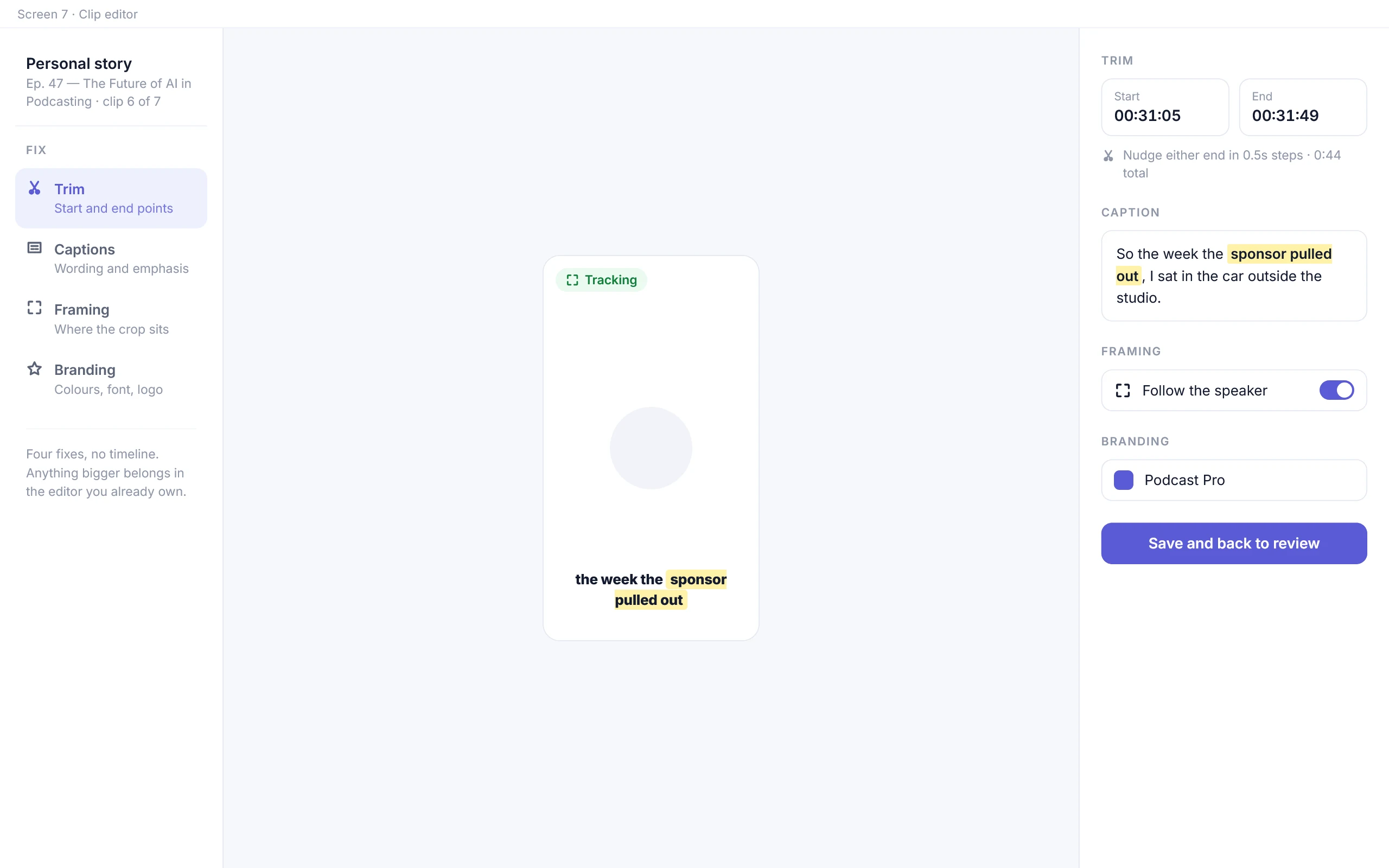
The editor deliberately does not try to be a video editor. It exposes exactly the
four things the AI is most likely to get slightly wrong: trim points, caption
text, framing, and branding.
A generated clip is a rough draft that goes wrong in fairly predictable ways.
Fixing those four things is quicker than opening a timeline. Anything bigger
than that belongs in the editing tool people already own.
nanoclip.ai
06
Brand kits carry decisions forward
Colours, fonts, caption styling and logo placement are saved as named kits and
applied per episode.
For the host this removes a repeated decision. For the VA running four shows it
is what keeps one client’s look from leaking into another’s — without relying on
the operator to remember.
nanoclip.ai
07
Finish with proof, not a dialog box
Export confirms what was produced, then offers the two things a user actually
wants next: download the batch, or schedule the posts.
The last screen asks one question about clip quality. Asking once, right after
something worked, gets a far more honest answer than a survey next week.
nanoclip.ai
Export confirms what was produced, per clip and per format.
nanoclip.ai
And asks one question — the only realistic way the model learns this show.
When the AI gets it wrong
▲The AI is usually right, and sometimes wrong with total confidence.
85–100%
High confidence
Glance and approve
Three seconds of your time. It is almost certainly fine as it came out.
60–84%
Medium confidence
Open and check
Usually a good moment that starts or ends in the wrong place. Trim it, do not bin it.
Below 60%
Low confidence
Read properly, or skip
Still shown, never hidden. Filtering it out would be the tool deciding for you.
The number does not have to be exact. It just has to tell you where to look first.
Why nothing here publishes on its own
The same thing runs through every screen: the model is right most of the time,
and every so often it is wrong while looking just as sure. The interface has to
show which is which.
It is also why nothing posts by itself, why the flow ends on a person clicking
something, and why weak clips stay on screen instead of being quietly hidden.
The tool can suggest and explain. The person still signs off. Cutting that
last step would make the product faster and a lot worse.
What I’d test next
This is a concept and a working prototype. What it has not had yet is real people
using it on their own episodes, which is where the answers are. The questions
worth putting to usage data rather than to opinion:
Where do people actually get stuck? Not where the flow predicts they will —
where they hesitate, back out, or repeat a step. Those are the points the
design missed.
Are the confidence scores being used at all? They only earn their place if
people read them as a signal of how a clip is likely to perform. If everyone
opens every clip regardless, the scores are decoration and the review screen
should be built differently.
Did it genuinely save time, and was the output still good? Both halves
matter. Faster with worse clips is not a win, and neither is a beautiful clip
that took as long as doing it by hand.
What frustrates people that I did not anticipate? The states I designed for
are the ones I could imagine. Session recordings and support messages are where
the rest show up.
Outcome
✦A prototype the team could argue with, rather than slides.
What was delivered
A structured end-to-end UX concept and an interactive prototype covering upload,
processing, review, editing, branding and export — ten screens, two task flows,
a decision tree and a storyboard.
Building it as a working prototype rather than a deck surfaced the states that
were missing: what the screen shows when processing fails, when every clip is
rejected, when a second show’s brand kit is active. It gave the team something
concrete to react to.
Project created in collaboration with the Latent Spaces team. Claude Design and
Claude Code were used as prototyping and implementation tools.